Shortcodes
This Wordpress theme "Dino| Restaurant WordPress Theme" comes with several shortcodes that helps in customizing your content easier.
Timeline
Timeline Shortcode lets you create an elegant and animated timeline in both vertical and horizontal looks on your website. It helps you to populate your website with great announcements and notifications. Notably, you can set the timeline express with date and time in proper sequential order.
[vc_row full_width="stretch_row"][vc_column][dt_sc_horizontal_timeline column="2"][dt_sc_hr_timeline_entry title="JAN 2015"]Lorem ipsum dolor sit amet, consectetur adipiscing elit. Morbi hendrerit elit turpis, a porttitor tellus sollicitudin at. Class aptent taciti sociosqu ad litora torquent per conubia nostra.[/dt_sc_hr_timeline_entry][dt_sc_hr_timeline_entry title="FEB 2015"]Lorem ipsum dolor sit amet, consectetur adipiscing elit. Morbi hendrerit elit turpis, a porttitor tellus sollicitudin at. Class aptent taciti sociosqu ad litora torquent per conubia nostra.
[/dt_sc_hr_timeline_entry][dt_sc_hr_timeline_entry title="MAR 2015" class="bottom"]Lorem ipsum dolor sit amet, consectetur adipiscing elit. Morbi hendrerit elit turpis, a porttitor tellus sollicitudin at. Class aptent taciti sociosqu ad litora torquent per conubia nostra.
[/dt_sc_hr_timeline_entry][dt_sc_hr_timeline_entry title="APR 2015" class="bottom"]Lorem ipsum dolor sit amet, consectetur adipiscing elit. Morbi hendrerit elit turpis, a porttitor tellus sollicitudin at. Class aptent taciti sociosqu ad litora torquent per conubia nostra.
[/dt_sc_hr_timeline_entry][/dt_sc_horizontal_timeline][/vc_column][/vc_row]
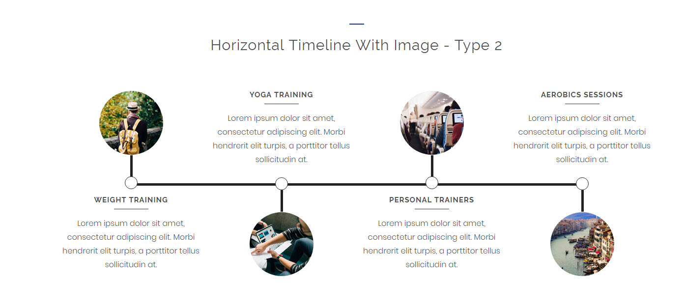
Horizontal Timeline
Available Parameters
type - The available options are type1 and type2. This option let you display your timeline in two variant attractive looks.
column - The available options are 2, 3, and 4 columns. This option lets you set the number of grid columns for the timeline.
class - Using this option you can add a custom class to the wrapping HTML element and do furthermore CSS customization on the element.
Vertical Timeline
Available Parameters
type - The available options are type1,type2,type3,type4,andtype5,. This option let you display your timeline in two variant attractive looks.
class - Using this option you can add a custom class to the wrapping HTML element and do furthermore CSS customization on the element.
Timeline Entry
Timeline entry allows you to add content on the timeline.
Available Parameters
title - This option let you add text that will be shown as the title of the timeline post..
image - This option let you add an image for the timeline post. This option is only available in horizontal timeline.
icon type - The available options are font awesome, icon class and image. By selecting anyone from above options and you can set the icon for the timeline post. By choosing the font awesome option you can select the icon directly from the prebuilt icon library. If you choose the icon class option, you can add the icon by adding icon class name. If you choose the image option, you can directly add the image icon from your media library. As well, you can also add image hover text by using image hover text option.
Note: The image icon adding option only available in Hoorizontal timeline option.subtitle - This option let you add text that will be shown as the subtitle in the timeline post.
content - The content option lets you add contents in a stylish look that are integrated with wonderful links.
class - Using this option you can add a custom class to the wrapping HTML element and do furthermore CSS customization on the element.
Team
The team shortcode allows you to present your team member details on your webpage.
[vc_row][vc_column width="1/4" el_class="rs_col-sm-6"][dt_sc_team name="Marc Coppolo" role="Associate Crime" image="10383" facebook="#" twitter="#" google="#" linkedin="#"][/dt_sc_team][/vc_column][vc_column width="1/4" el_class="rs_col-sm-6"][dt_sc_team name="Lindsay Lohan" role="Associate Economics" image="10384" facebook="#" twitter="#" google="#" linkedin="#"][/dt_sc_team][/vc_column][vc_column width="1/4" el_class="rs_col-sm-6"][dt_sc_team name="Daniel Craig" role="Associate Crime" image="10385" facebook="#" twitter="#" google="#" linkedin="#"][/dt_sc_team][/vc_column][vc_column width="1/4" el_class="rs_col-sm-6"][dt_sc_team name="James Wan" role="Manager" image="10386" facebook="#" twitter="#" google="#" linkedin="#"][/dt_sc_team][/vc_column][/vc_rows]
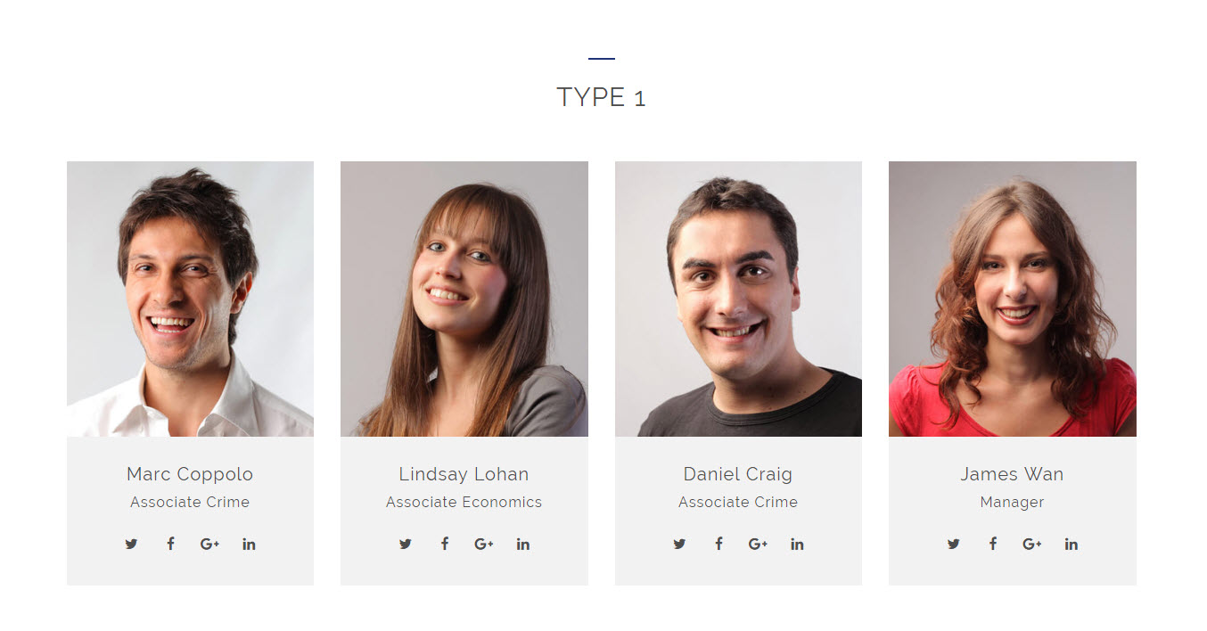
Available Parameters
name - This option allows you to add your team member name.
role - This option allows you to add your team member role on the team.
image - This option allows you to add your team member image.
teamstyle - The available options are default, social on hover, social and role on hover, details on hover, show details & social on hover, horizontal, and rounded. This option let you set an engaging design for your team section.
socialstyle - The available options are default, rounded border, rounded square, square border, diamond square border, and hexagon border. This option let you set an appealing design for the social icons shown on your team section.
facebook - This option allows you to add your link to the facebook icon in the team section.
twitter - This option allows you to add your link to the twitter icon in the team section.
google - This option allows you to add your link to the google plus icon in the team section.
linkedin - This option allows you to add your link to the linkedin icon in the team section.
content - The content option lets you add a short description about your team member.
class - Using this option you can add a custom class to the wrapping HTML element and do furthermore CSS customization on the element.
Contact Info
The contact shortcode lets you add the contact details in the website. The contact details will be the best way for your customers to stay in touch with you.
[vc_row][vc_column][/vc_column][vc_column width="1/3"][dt_sc_contact_info type="type2" icon="pe-icon pe-call" title="Talk to us"]Toll Free: 1224 2234 LAW [dt_sc_br br="1"] Fax: 1224 2235 225[/dt_sc_contact_info][/vc_column][vc_column width="1/3"][dt_sc_contact_info type="type2" icon="pe-icon pe-mail" title="Mail us @"] support@livecon.com [dt_sc_br br="1"] admin@livecon.com [/dt_sc_contact_info][/vc_column][vc_column width="1/3"][dt_sc_contact_info type="type2" icon="pe-icon pe-map-marker" title="Our Location"]625 @ David Blake Road, [dt_sc_br br="1"] Adventureland, LA 14536, USA[/dt_sc_contact_info][/vc_column][/vc_row]
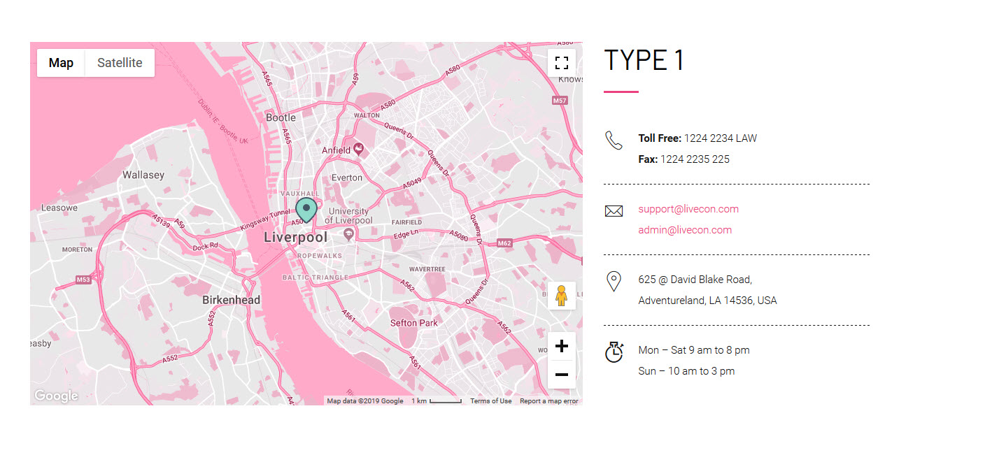
Available Parameters
type - The available options are type1, type2, type3, type4, type5, type6, type7 and type8. This option let you display your contact details in eight catchy looks.
icon - The icon class option let you add icons for the contact details. You can add the icon by adding icon class name on the icon class field in the element.
title - This option lets you add text that will be shown as the title of a column or row shown on the contact details.
content - The content option lets you add the details for the column or row shown on the contact details.
class - Using this option you can add a custom class to the wrapping HTML element and do furthermore CSS customization on the element.
link - The URL option lets you add a link and title caption for the title. This option only available at type5.
Buttons
The button shortcode lets you add the button anywhere on the page.
[vc_row][vc_column width="1/3"][dt_sc_button title="Click Here" style="filled" class="type1"][/vc_column]
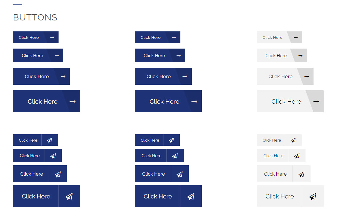
Button
The colored button shortcode lets you add the button with multi colors in anywhere on the page.
Available Parameters
title - The title option lets you add the text that shown inside the button.
link - The URL option lets you add a link and title caption for the title.
size - The available options are small, medium, large, and xlarge. This option let you set the size of the button.
textcolor - This option lets you add your preferred color for the button text.
textsize - This option lets you set the size of the button text.
Use theme default font family? - The available option is yes. This option let you set the default font type for the entire column or row content.
bgcolor - The available options are blue, brown, cadetblue, chillipepper, cyan, darkgolden, deeporange, deeppurple, green, lime, magenta, orange, pink, purple, red, skyblue, teal, turquoise, wisteria, yellow, and black. This option let you set the background color of the button. Note: You can add your preferred color with the the custom background color option.
style - The available options are bordered, filled, filled rounded corner, rounded corner, rounded border, fully rounded border, and fully rounded corner. This option let you set the style of the button.
icon type - The available options are font awesome, and icon class. By selecting anyone from above options and you can set the icon for the timeline post. By choosing the font awesome option you can select the icon directly from the prebuilt icon library. If you choose the icon class option, you can add the icon by adding icon class name.
iconalign - The available options are left and right. This option let you set the alignment of the button icon.
animation - The available options are flash, shake, bounce, tada, swing, wobble, pulse, flip, flipInX, flipOutX, flipInY, flipOutY, fadeIn, fadeInUp, fadeInDown, fadeInLeft, fadeInRight, fadeInUpBig, fadeInDownBig, fadeInLeftBig, fadeInRightBig, fadeOut, fadeOutUp, fadeOutDown, fadeOutLeft, fadeOutRight, fadeOutUpBig, fadeOutDownBig, fadeOutLeftBig, fadeOutRightBig, bounceIn, bounceInUp, bounceInDown, bounceInLeft, bounceInRight, bounceOut, bounceOutUp, bounceOutDown, bounceOutLeft, bounceOutRight, rotateIn, rotateInUpLeft, rotateInDownLeft, rotateInDownLeft, rotateInUpRight, rotateInDownRight, rotateOut, rotateOutUpLeft, rotateOutDownLeft, rotateOutUpRight, rotateOutDownRight, hinge, rollIn, rollOut, lightSpeedIn, lightSpeedOut, slideDown, slideUp, slideLeft, slideRight, slideExpandUp, expandUp, expandOpen, bigEntrance, hatch, floating, tossing, pullUp, pullDown, stretchLeft, and stretchRight. This option let you set the animation for the button loading.
class - Using this option you can add a custom class to the wrapping HTML element and do furthermore CSS customization on the element.
Colored Button
The colored button shortcode lets you add the button with multi colors in anywhere on the page.
Available Parameters
title - The option let you add text that will be shown as the title inside the button.
subtitle - The text option lets you add the text that will be shown as the sub title inside the button.
link - The URL option lets you add a link and title caption for the title.
color - The available options are blue, brown, cadetblue, chillipepper, cyan, darkgolden, deeporange, deeppurple, green, lime, magenta, orange, pink, purple, red, skyblue, teal, turquoise, wisteria, yellow, and black. This option let you set the color of the button.
icon_type - The available options are font awesome and icon class. By selecting anyone from the above options and you can set the icon for the button. By choosing the font awesome option you can select the icon directly from the prebuilt icon library. If you choose the icon class option, you can add the icon by adding icon class name.
class - Using this option you can add a custom class to the wrapping HTML element and do furthermore CSS customization on the element.
Tabs
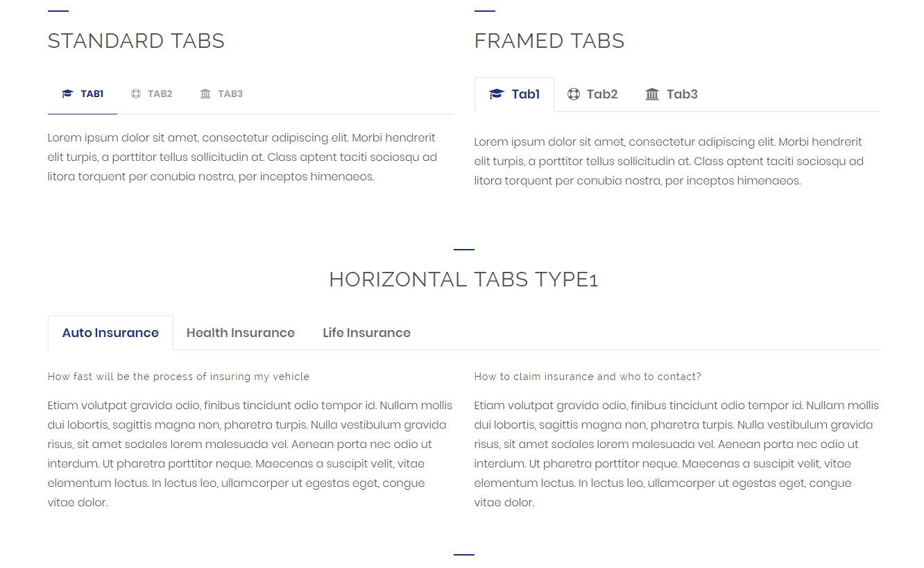
The tabs shortcode let you create tab section where content separated in multiple tabs containing the title of the content on the website. The viewers can see the content they want by clicking the corresponding tab.
[vc_row][vc_column][dt_sc_tabs][dt_sc_tab icon_type="custom" title="Tab1" tab_id="def1451038607-1-24" icon_class="fa fa-graduation-cap"][vc_column_text css=".vc_custom_1451041512199{margin-bottom: 0px !important;}"]Lorem ipsum dolor sit amet, consectetur adipiscing elit. Morbi hendrerit elit turpis, a porttitor tellus sollicitudin at. Class aptent taciti sociosqu ad litora torquent per conubia nostra, per inceptos himenaeos.[/vc_column_text][/dt_sc_tab][dt_sc_tab icon_type="custom" title="Tab2" tab_id="1451038805868-1-2" icon_class="fa fa-life-bouy"][vc_column_text css=".vc_custom_1451041543238{margin-bottom: 0px !important;}"]Lorem ipsum dolor sit amet, consectetur adipiscing elit. Morbi hendrerit elit turpis, a porttitor tellus sollicitudin at. Class aptent taciti sociosqu ad litora torquent per conubia nostra, per inceptos himenaeos.[/vc_column_text][/dt_sc_tab][dt_sc_tab icon_type="custom" title="Tab3" tab_id="1451038819984-2-8" icon_class="fa fa-university"][vc_column_text css=".vc_custom_1451041551610{margin-bottom: 0px !important;}"]Lorem ipsum dolor sit amet, consectetur adipiscing elit. Morbi hendrerit elit turpis, a porttitor tellus sollicitudin at. Class aptent taciti sociosqu ad litora torquent per conubia nostra, per inceptos himenaeos.[/vc_column_text][/dt_sc_tab][/dt_sc_tabs][/vc_column][/vc_row]
Tabs
Available Parameters
type - The available options are horizontal and vertical. This option let you display your tabs in two variant looks.
style - The available options are default and frame. This option let you set an engaging design for your tabs section.
class - Using this option you can add a custom class to the wrapping HTML element and do furthermore CSS customization on the element.
Tab
Available Parameters
title - This option let you add text that will be shown as the title of the tab post.
subtitle -This option lets you add the text for the subtitle.
icon type -The available options are font awesome, icon class and image. By selecting anyone from the above options and you can set the icon for the tab. By choosing the font awesome option you can select the icon directly from the prebuilt icon library. If you choose the icon class option, you can add the icon by adding icon class name. If you choose the image option, you can directly add the image icon from your media library.
Image Caption
The image caption shortcode lets show the images in 9 visually attractive caption looks.
 [vc_row][vc_column][vc_row_inner][vc_column_inner width="1/3"][dt_sc_image_caption title="Morbi fringilla eros" subtitle="Semper vel ante" image="10295" icon="icon icon-compasstool"]Lorem ipsum dolor sit amet, consectetur adipiscing elit. Morbi hendrerit elit turpis, a porttitor tellus sollicitudin at. Class aptent taciti sociosqu ad litora torquent per conubia nostra, per inceptos himenaeos.
[dt_sc_button title="Read More" size="medium" style="filled"][/dt_sc_image_caption][/vc_column_inner][vc_column_inner width="1/3"][dt_sc_image_caption title="Phasellus mollis nulla" subtitle="Curabitur eget" image="10296" icon="icon icon-tools"]Lorem ipsum dolor sit amet, consectetur adipiscing elit. Morbi hendrerit elit turpis, a porttitor tellus sollicitudin at. Class aptent taciti sociosqu ad litora torquent per conubia nostra, per inceptos himenaeos.
[dt_sc_button title="Read More" size="medium" style="filled"][/dt_sc_image_caption][/vc_column_inner][vc_column_inner width="1/3"][dt_sc_image_caption title="Vivamus euismod sodales" subtitle="Pellentesque lobortis" image="10297" icon="icon icon-house"]Lorem ipsum dolor sit amet, consectetur adipiscing elit. Morbi hendrerit elit turpis, a porttitor tellus sollicitudin at. Class aptent taciti sociosqu ad litora torquent per conubia nostra, per inceptos himenaeos.
[dt_sc_button title="Read More" size="medium" style="filled"][/dt_sc_image_caption][/vc_column_inner][/vc_row_inner][/vc_column][/vc_row]
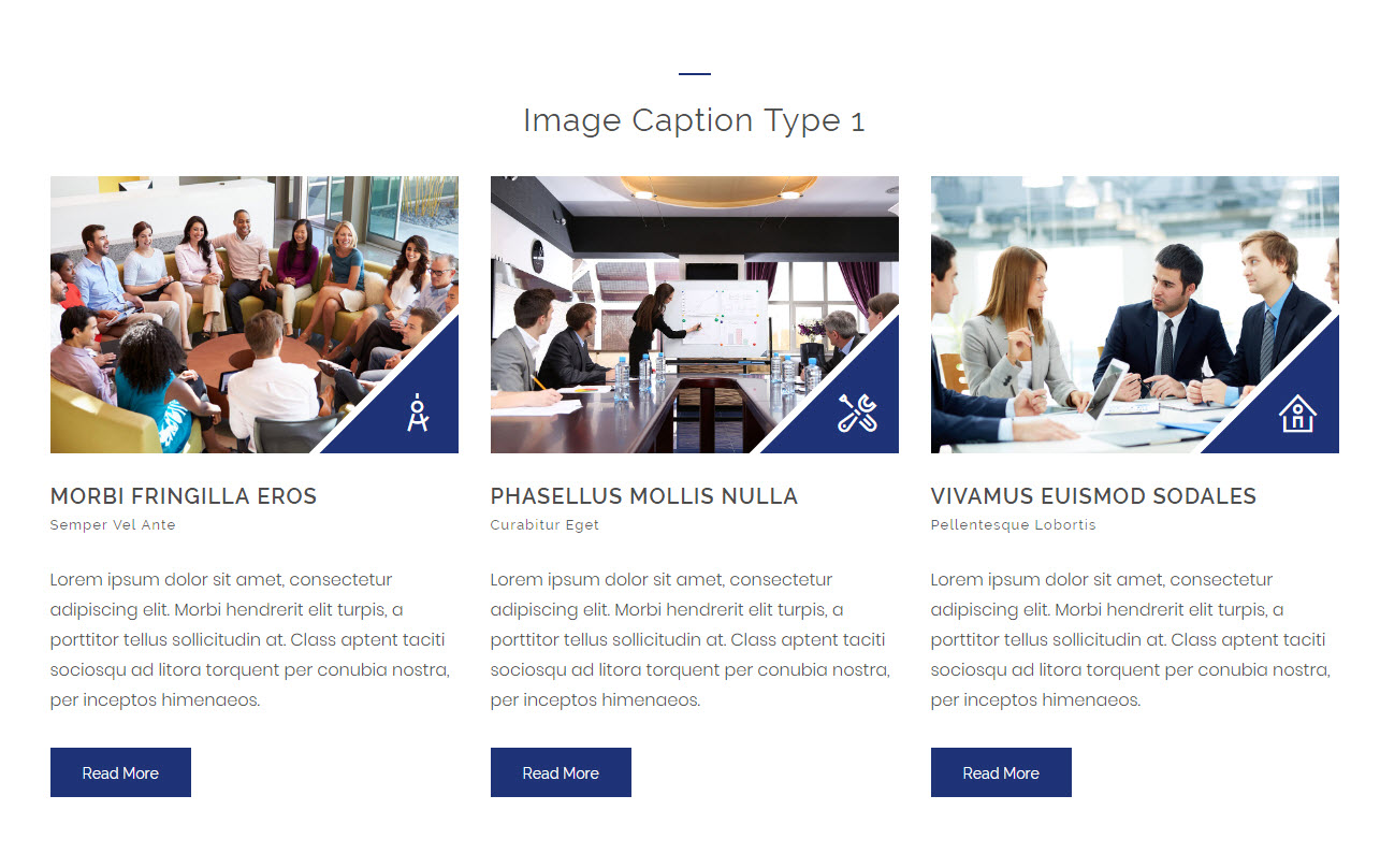
Image Caption
Available Parameters
type - The available options are type1, type2, type3, type4, type5, type6, type 7, type8, and type9.This option let you display your images in 10 varinat eye-catching looks.
title - This option let you add text that will be shown as the title of the image post.
title_link - The title link option lets you add a link and title caption for the title.
subtitle - This option lets you add the text for the subtitle.
image - This option let you add an image for the image post.
imgpos - The available options are default and below content. This option lets you set the image below the content.
icon - The available options are icon class and image. By selecting anyone from the above options and you can set the icon for the image post. By choosing the icon class option, you can add the icon by adding icon class name. If you choose the image option, you can directly add the image icon from your media library.
content - The content option lets you add the description for the image post.
class - Using this option you can add a custom class to the wrapping HTML element and do furthermore CSS customization on the element.
Image Flip
Available Parameters
image 1 and image 2 - These options let you add images to the flip box.
link - The title link option lets you add a link and title caption for the title.
Pricing Table
The pricing table shortcodes let you create highly catchy pricing table to showcase your best pricing and offers details to the viewers.
[dt_sc_team name="Marc Coppolo" role="Associate Crime" image="7048" facebook="#" twitter="#" google="#" linkedin="#"][/dt_sc_team]
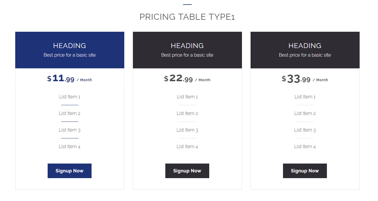
Pricing Box 1
Available Parameters
heading - This option let you add text that will be shown as the title of the pricing box.
subtitle - This option lets you add the text for the subtitle.
is active - The available options is yes. If you select this option the pricing box will be highlighted when you hover the pricing table.
Image - The image option lets you add the image for the pricing table.
currency - This option lets you set the symbol of the currency.
price - The price option lets you set the price for the pricing table.
per month - The price unit option lets you set the unit for the pricing.
type - The available options are standard and classic. This option let you display your pricing table in two variant engaging looks.
content -The content option lets you add a short description for the pricing table.
link - The url option lets you add a link and title caption for the title.
Pricing Box 2
Available Parameters
heading - This option let you add text that will be shown as the title of the pricing box.
subtitle - This option lets you add the text for the subtitle.
is active - The available options is yes. If you select this option the pricing box will be highlighted when you hover the pricing table.
icon - The available options are font awesome and icon class. By selecting anyone from the above options and you can set the icon for the pricing table. By choosing the font awesome option you can select the icon directly from the prebuilt icon library. If you choose the icon class option, you can add the icon by adding icon class name.
starting - This option lets you add the text before the price.
price - The price option lets you set the price for the pricing table.
permonth - The price unit option lets you set the unit for the pricing.
link - The url option lets you add a link and title caption for the title.
Pricing Box 3
Available Parameters
number - This option lets you add the numerical value for showing the plan period.
currency - This option lets you set the symbol of the currency.
price - The price option lets you set the price for the pricing table.
month - The price unit option lets you set the unit for the pricing.
plan - This option let you describe the plan validated for a week, month and year.
content - The content option lets you add a short description for the pricing table.
is active - The available options is yes. If you select the option the pricing box will be highlighted when you hover the pricing table.
link - The url option lets you add a link and title caption for the title.
Pricing Box 4
Available Parameters
heading - This option let you add text that will be shown as the title of the pricing box.
subtitle - This option lets you add the text for the subtitle.
is active - The available options is yes. If you select this option the pricing box will be highlighted when you hover the pricing table.
Image - The image option lets you add the image for the pricing table.
currency - This option lets you set the symbol of the currency.
price - The price option lets you set the price for the pricing table.
per month - The price unit option lets you set the unit for the pricing.
type - The available options are standard and classic. This option let you display your pricing table in two variant engaging looks.
content -The content option lets you add a short description for the pricing table.
link - The url option lets you add a link and title caption for the title.
Portfolios
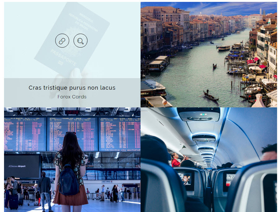
The Portfolio shortcode let you create a responsive portfolio with multiple columns and filters for showcasing your best works.
[vc_row][vc_column][dt_sc_portfolios column="4" style="type3" allow_gridspace="no" allow_filter="no" count="2"][/vc_column][/vc_row]
Available Parameters
count - This option let you set the number of posts to be displayed on the page.
columns - The available options are 2, 3, and 4 columns. This option let you set the number of columns for displaying the posts.
style - The available options are modern title, title & icons overlay, title overlay, icons only, classic, minimal icons, presentation, girly,and art. This option let you set an engaging design for your portfolio items.
allow_gridspace - The available options are yes and no. If you select the option yes the portfolio items will be shown in grid look. If you select the no the portfolio items will be shown in the attached look.
allow_filter - The available options are yes and no. This option let you enable or disable the filters on the page.
terms - This option let you display your preferred category posts only on the page.
Recent Posts
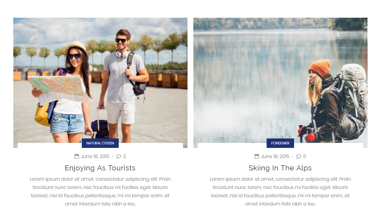
The recent posts shortcode let you create a responsive blog section with author, date, category, and tags in multiple columns to show your expertise. Also, it provides the best way to drive traffic to your websites with dynamic content.
[vc_row][vc_column][dt_sc_recent_post column="2" excerpt_length="40"][dt_sc_button size="small" iconclass="fa fa-long-arrow-right" iconalign="icon-right with-icon" style="filled" class="type1" title="Read More" icon_type="fontawesome" target="_blank" /][/dt_sc_recent_post][/vc_column][/vc_row]
Available Parameters
count - This option let you set the number of posts to be displayed on the page.
columns - The available options are I Column, II Columns, and III Columns . This option let you set the number of columns for displaying the posts.
style - The available options are default, date left, date and author left, medium, medium highlight, and medium skin highlight. This option let you set the blog in attractive looks.
allow_excerpt - This option let you display a description with your preferred length about the post content.
excerpt_length - This option let you set the number of words need to be displayed from the excerpt content.
show_post_format - The available options are yes and no. This option let you show and hide the format of the post.
show_author - The available options are yes and no. This option let you show and hide the author name of the post.
show_date - The available options are yes and no. This option let you show and hide the published date of the post.
show_comment - The available options are yes and no.This option let you show and hide the comment of the post.
show_category - The available options are yes and no.This option let you show and hide the category of the post.
show_tag - The available options are yes and no.This option let you show and hide the tags of the post.
read more button - This option let you add the button for the post.
